Table of Contents
If you’re looking for a little bit of help managing worry, practicing mindfulness, or coping with mild mental health issues, there are a number of AI chatbot apps that are designed to help. And if you’re a UX writer, especially one interested in conversation design, you may want to check out these apps to see how they address the many challenges of creating a chatbot for mental health. I recommend UX writers download the chatbot app Woebot to see the impact good conversation design can have. And as a bonus, you get to chat with a delightful little robot.
When I first heard about these apps, I was concerned about the possibility of people using a chatbot for a job that really requires a human therapist. But rather than an alternative to a therapist, they should be thought of as alternatives to self-help books/workbooks, or non-AI based mental health apps. Woebot and other similar apps deliver mental health tools, tips, and practices in a friendly and easily digestible format. And the interactive component can add value that a book can’t.
So, let’s take a tour of Woebot to see how this app works and what we can learn about chatbot design:
Getting to Know You
Onboarding is a critical step in any app, and for a chatbot, setting the tone is critical. Woebot succeeds here before you even download the app: the name is perfect. It sets the humorous tone that will be present throughout, even while the chatbot deals with difficult issues.
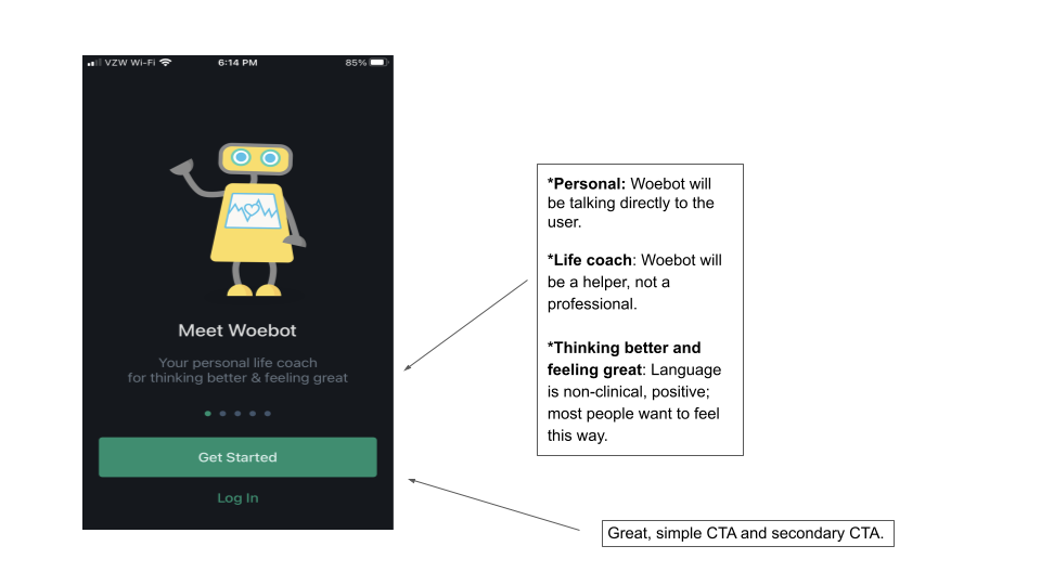
The opening screen is dominated by a cute image of a robot (er, Woebot), and simple but powerful text. “Your personal life coach for thinking better and feeling great” gets at everything the app can do, without overpromising.
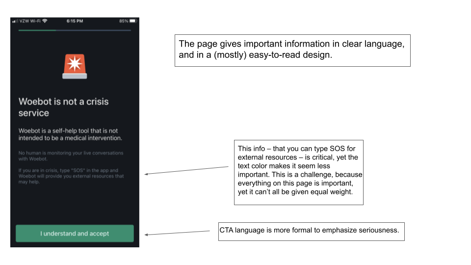
Next, Woebot provides a disclaimer that could be a model for anyone designing for mental health products. With a full screen warning that you have to accept to move on, Woebot tells you everything you need to know: It’s a self-help product, not a medical intervention; it’s not monitored, and you can type SOS for additional resources. One thing I might tweak is putting the SOS option in white instead of gray. It seems important, and it’s minimized here by the font color choice.
Okay, so now we’ve met Woebot the product. It’s time to meet Woebot the chatbot.
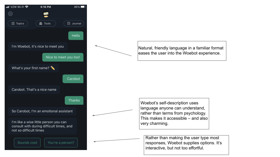
The basic layout will be familiar to anyone who spends time text messaging (so, most people), and that familiarity reduces the cognitive load. Meeting Woebot really does feel like meeting a person, and that’s in part because the basic design of the app is already baked into most smartphone user’s day-to-day experience. That allows the user to focus on what Woebot is saying, rather than on learning a new tool.
The voice and tone is friendly, and Woebot’s self-description, “A wise little person you can consult with during difficult times and not so difficult times,” is charming and relatable. There’s no complicated terminology here, just phrases like “difficult and not so difficult times.”
How was your day?
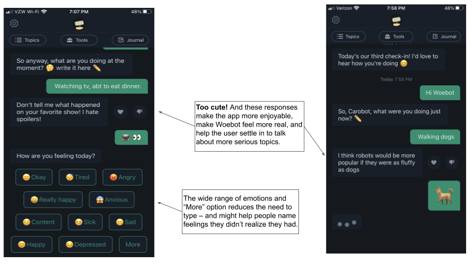
One of Woebot’s main functions is the daily check in. You set a time of day, and Woebot will ask you to check in at that time. Daily notifications are a common app feature, but Woebot’s really do feel like getting a daily check-in from a friend. The check-ins are really where Woebot’s conversation design shines. The check-ins are super flexible, and I suspect it is programmed with a huge number of common responses. The fact that the app “knew” what I was saying reduced some resistance that I felt about wasting valuable thumb typing energy texting with a robot.
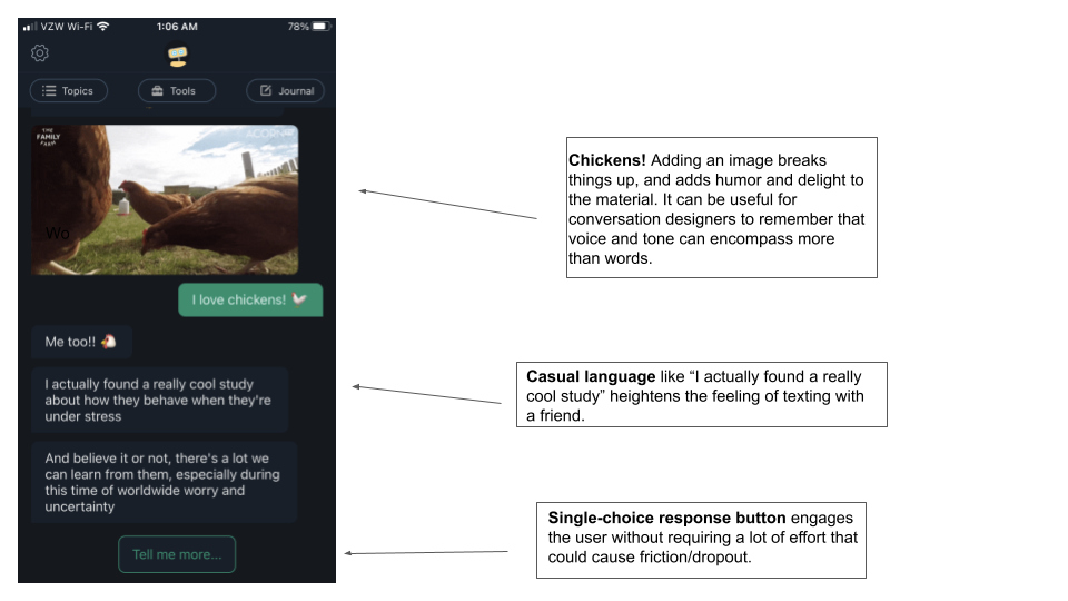
Depending on how you’re feeling, you can choose to just talk freely to Woebot, do a mindfulness exercise, or learn a tip for better mental health and well-being. You can choose what you want every step of the way (and there are additional tools and topics available at the top menu if Woebot doesn’t offer what you want in the chat). The mental health tools, which primarily come from cognitive behavioral therapy, are presented in helpful, bite-sized chunks with Woebot’s characteristic humor. User’s don’t need to type answers to most questions, but the material is presented in little bits broken up by response options like “Tell me more” and “What do you mean?” And sometimes there are pictures of chickens.
What can we learn?
There’s much more to explore in Woebot, and I recommend anyone interested in microcopy, writing for chatbots, or who simply wants to be astonished by how natural and delightful a chatbot can be to check it out.
Creating a chatbot for a mental health app poses different challenges than more customer-service oriented chatbots, which tend to be much more utilitarian. What can the example of Woebot teach us about creating mental health chatbots?
- Have a personality–but don’t pretend to be human. Chatting with Woebot was genuinely enjoyable. And if it wasn’t, users wouldn’t stick around to get the benefits of the app. So the approachable voice, sense of humor, and chicken pictures really matter. But it’s also important for users to be reminded that they are not talking to a person, especially if they are processing difficult emotions using the app. By having a distinct and appealing voice, but calling itself “a wise little being” and offering response options for the users (which couldn’t happen in a real conversation), Woebot’s design doesn’t let you forget it’s not real, while making the experience a pleasure.
- Reduce cognitive load–and typing. One of the great strengths of Woebot is that it’s easy. It requires very few typed responses. In most cases, you can choose from a set of responses – and often, you only have one choice. While I can imagine someone being irritated at having to click something when there’s not a choice, I found it kept me engaged in the content but not distracted by choices. Offering choices also means that the AI doesn’t have to correctly recognize as many typed responses. And that’s easier on designers, but also more pleasurable for users, who don’t have to deal with as many slightly off responses.
- Provide lots of options. Woebot really does work as a one-stop shop for well-being. You can have a free-form talk, or select from a wide range of modules with therapy tools, relaxation exercises, mindfulness, and more. Woebot can recommend these based on what you type in the chat, or you can select them from the simple menu at the top. Having all of this available makes it more likely that people will use the app in a variety of different situations, so they can get more benefit from it. Of course, it’s better to do one thing well than a bunch of things poorly, but the lesson from Woebot is that a lot of different tools can benefit users, and it’s great to offer what you can.
- Be very clear about your limitations. Woebot’s disclaimer screen is excellent. It’s clear about what it can and cannot do, and offers suggestions for what to do if you need something beyond the scope. I think that Woebot’s sense of humor, gentle as it is, is also a helpful reminder of the scope of the tool. The approach is very light-hearted, which may serve to remind the user it’s not necessarily suitable for situations that are more serious.
What do you think? Are there more lessons to learn from Woebot? Any drawbacks to the product? I really enjoyed using it, but I’m sure there is much more to be done in this growing field.

